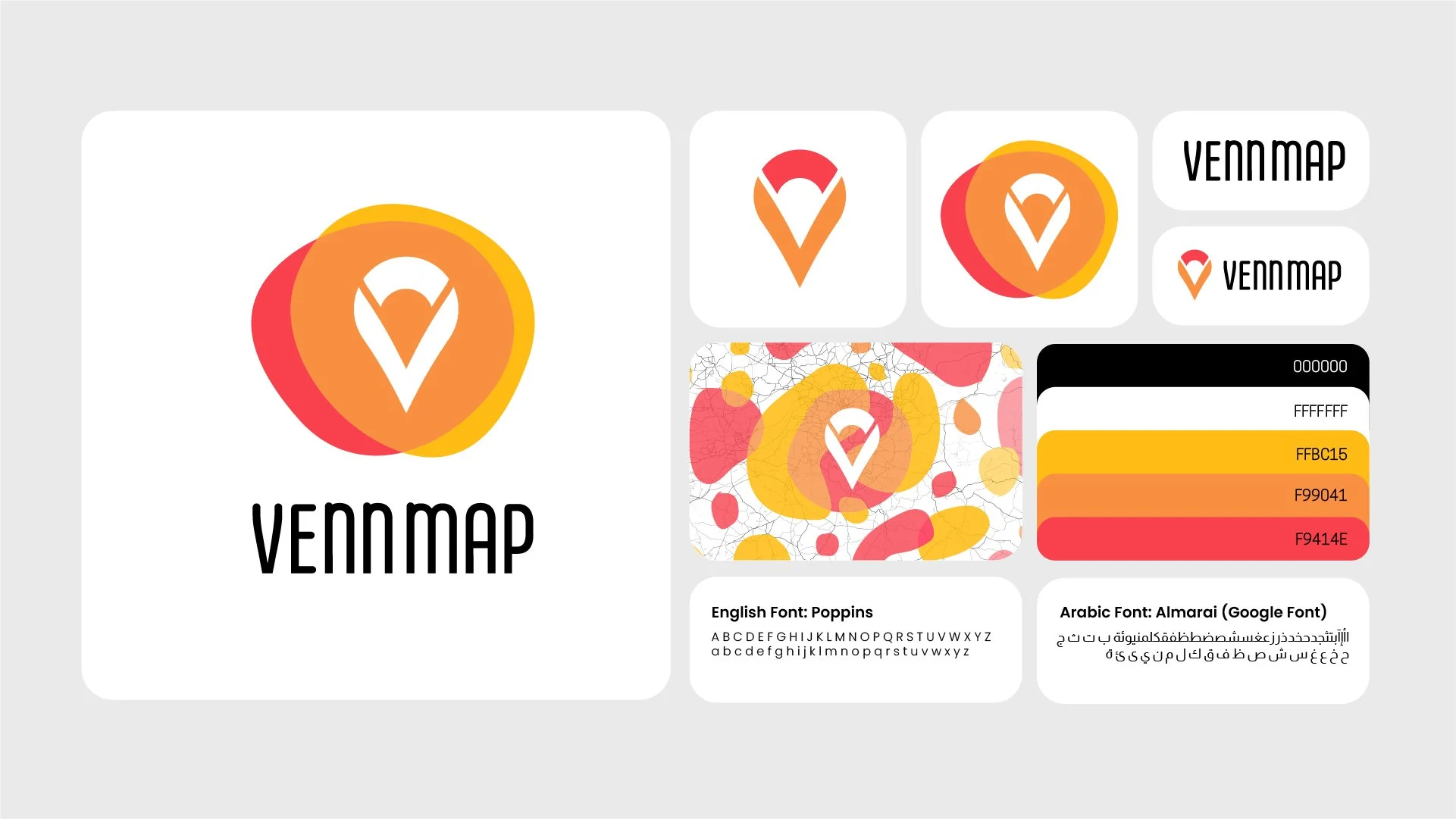
Vennmap Brand Identity
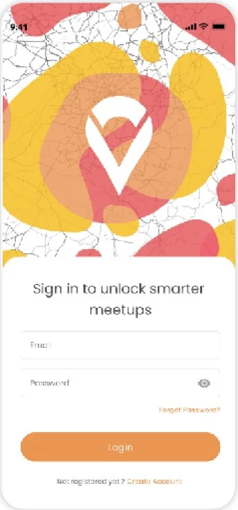
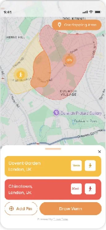
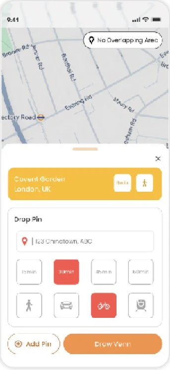
An app that helps people find the smartest places to meet. It factors in location, travel time, and transport methods to generate shared, convenient meeting spots.
The brand is focused on being bright and engaging, inviting in users of all ages. Its structure is straightforward with no frills or hassle at all, neither in its brand visual nor in its UI.
PROPOSED CONCEPTS

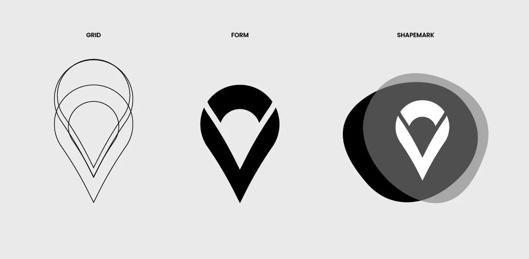
CONCEPT 01
The letter V for Vennmap
Abstract treatment for the app’s zoning feature
Overlapping elements representing venn-diagrams

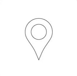
CONCEPT 02
The letter V for Vennmap
disconnected spaces to represent zoning
Silhouette of a location pin for a at-a-glance clarity on offering and main outcome of the app

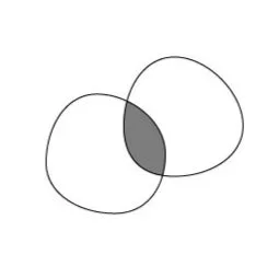
CONCEPT 03
V with M for both Venn and Map
Overlapping V and M to represent the zoning feature
Silhouette of a location pin for a at-a-glance clarity on offering and main outcome of the app