BRAND IDENTITY - LOGO DESIGN - VISUAL IDENTITY
Open2X
Open2X is a fintech platform that consolidates a user's financial accounts across multiple banking providers into a single, unified interface. The founders came with a name, a concept, and a need for a brand that could make something complex feel effortless.
PROPOSED CONCEPTS
Before committing to a direction, three distinct concepts were developed and presented to the founders, each exploring a different angle on what Open2X could stand for.

CONCEPT 01
Document structure for the digitization
of paperworkExporting process represented in arrow
Invoice represented by the grid
formatting typically seen in invoices

CONCEPT 02
Invoice icon represented with a folded corner
Linking system represented with a chain
linkRecognizable shapes for maximum clarity

CONCEPT 03
Document export and sharing platform
A chain link for the link-based platform
Hidden dollar sign for the finance
industry

DESIGN ELEMENTS
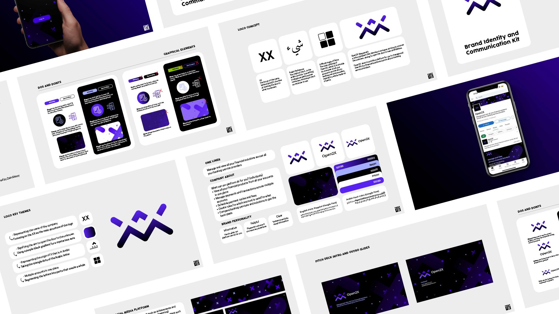
The selected direction drew from two unexpected sources: the structure of the name itself, and the Arabic roots embedded within it.

Referencing the name of the platform
> Focusing on the XX as the main structure of the logo

Representing the origin of X that is in Arabic
> Taking the triangle dots of the Arabic letter

Signifying the aim to open the door to the unknown
> Using a purple-black gradient for a mysterious aura

Multiple accounts in one place
> Segmenting the letters into parts that create a whole
PROJECT STATUS
Status: Identity approved and in active use. Role: Solo, Brand Identity
The identity work on Open2X extended into a UI/UX engagement. View the product design case study here.